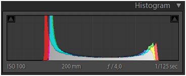
It´s interesting… allthough, normally, we all strive to achieve technical perfection (at least most of the time) while making photographies, there are sometimes images that do actually look “good”, while not beeing technically perfect. One of this “imperfections” is the faded effect: when an image´s colours are kind of cut-off at both ends of the histogram (i.e. neutralizing the highlights and the darks, leaving mainly the midtones), you get this kind of haze or fog on it. This makes the image actually less colourfull and less vibrant and less contrasty. Almost as an old polaroid which has been hit by time, sun and has lost it´s brilliance.
If you look at the VSCO Grid you will find many, many examples of images that have been processed this way. And I say processed, because none of the modern cameras would give you such a result… ´cause it´s actually (technically) “wrong”. In almost all books or tutorials about photography you will find, they teach you that you should always try to create the picture in such way, that the whole (or most of it) histogram is beeing covered. In that way you would preserve the maximum of highlights and darks:

But, as you can see (not only at the VSCO Grid, but at Instagram and on Eyeem, too), this kind of images have gained a lot of popularity among photographers in the last years. Almost all so-called “vintage”-effects do manipulate the tonal range of the image muting the blacks and the whites of it:

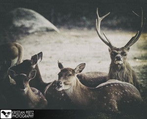
Some of them go even further an put in some grain and light leaks, vignettes and manipulate the colors and yaddayadda. But today I just wanted to talk about the fading effect. So, I chose some images today which actually had a “good” histogram, but were kind of lame… somehow boring and I thought, perhaps a bit of fading would do them good. So, I did. Here´s the result (original and faded):


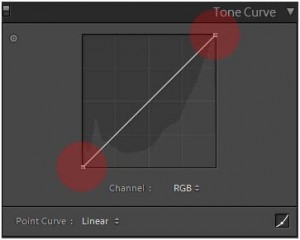
So, how do you achieve this effect? Easy… either in Photoshop or in Lightroom you just pick-up the Tone Curve and slide both ends (lights down and darks up) slide it:

This way you´re muting this range of the tones (check the resulting histogram) and you get the faded look. I then went on and put some grain and vignette over them and played a bit with the colour palette, but you get the point. It´s fun and allthough it does not work on all kind of images, some really get a new “life” with it. There are also many different techniques (playing with the offset is another way) to get this effect, but this one is actually very easy to use. Try it out! This video shows one way of doing it, at minute 1:50 :
If you want to follow me on VSCO or Instagram or Eyeem, just click on them:


One Response